List
A list of items. List item text is shown in a button. Data can be associated with each list item.
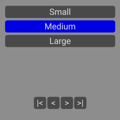
Use buttons below the list to move to first item, move to previous item, move to next item and move to last item.
| Name | Type | Default | Description |
|---|---|---|---|
| list | Array | empty | List of text/data items |
| selectedtext | string | blank | Optional text of currently selected list item to highlight |
| selectedindex | number | -1 | Alternatively, optional index of currently selected list item to highlight |
| overflow | number | 20 | Number of characters to display before text is truncated |
| width | number | 1 | Width of panel in meters |
| height | number | 1 | Height of panel in meters |
| popupmaterial | Material | Theme popup material (color gray) | Popup panel background color. Set to override custom material |
| selectable | InteractiveObjects | undefined | Add to list of objects ray caster can test for overlap |
| geometry | BufferGeoemtry | Rounded rectangle shape | Override to provide your own geometry for list background |
| Name | Type | Description |
|---|---|---|
| change | number | Triggered when list item selected. Event contains new ListItem (text and data) |
| close | void | Triggered when interaction outside of picker |
<flat-ui-list *ngIf="input.showlist" [list]="input.list" [selectedtext]="input.method.text"
              [position]="input.position" [rotation]="input.rotation" [selectable]="selectable"
              (change)="input.method.text = $event.text;input.showlist=false" (close)="input.showlist=false;input.closeinput()">
</flat-ui-list>